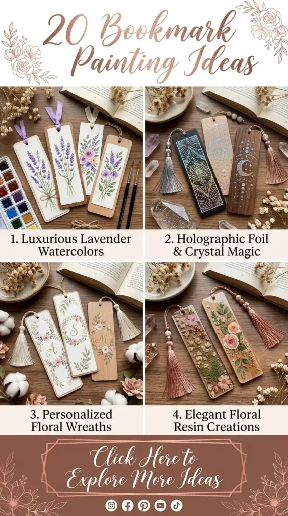
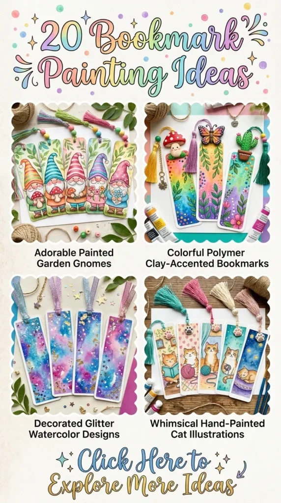
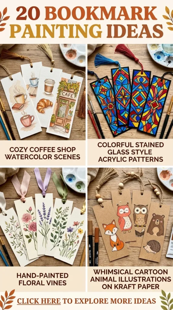
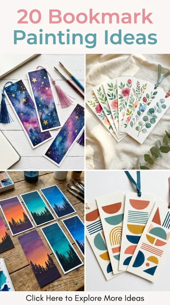
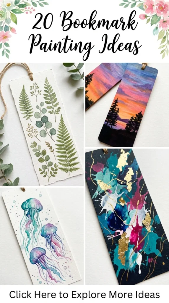
Handmade painted bookmarks turn everyday reading into a rich, visual ritual. Creating miniature works of art on heavy paper, wood, or raw linen combines tactile craftsmanship with modern design sensibilities. This comprehensive guide details twenty elegant, modern bookmark painting ideas complete with design philosophies, step-by-step creation methods, expert tips, and creative variations.
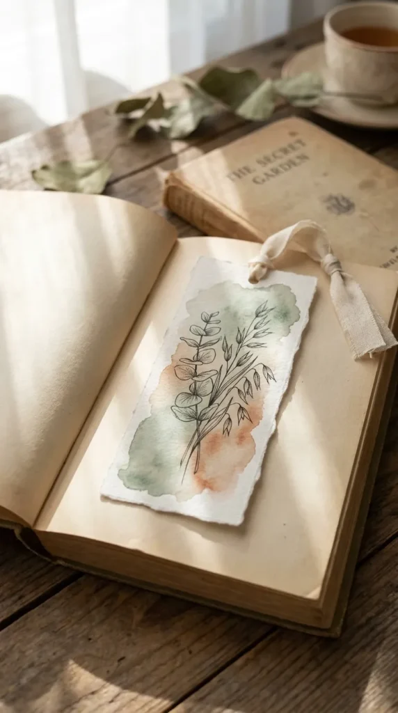
1. Minimalist Botanical Line Art over Earthy Watercolor Washes
Introduction Minimalist botanical line art paired with muted watercolor washes balances organic nature with modern Scandinavian restraint. This concept focuses on breathing room, delicate ink lines, and soft, blooming undertones that do not overwhelm the eye.
What This Idea Means This idea embraces wabi-sabi aesthetics: celebrating simplicity, gentle color transitions, and delicate plant silhouettes like eucalyptus, olive branches, and wild oats. The watercolor establishes an organic, atmospheric backdrop, while fine ink work provides clean structure.
How to Make It
- Cut a strip of 300 GSM cold-press watercolor paper to 2 x 7 inches.
- Lightly dampen the paper with clean water using a flat wash brush.
- Drop diluted hues of sage green, terracotta, or warm taupe onto the wet paper, letting the pigment bleed naturally.
- Allow the wash to dry completely.
- Using an archival 0.1mm or 0.3mm black waterproof fineliner, draw slender botanical stems with minimalist leaf clusters running vertically up the bookmark.
- Punch a neat hole at the top and thread a raw cream linen ribbon through.
Tips and Variations
- Keep your color wash concentrated in the lower third or middle of the bookmark to preserve white space.
- Variation: Swap black ink for metallic copper or liquid white gouache on a deep forest-green wash for a moodier look.
2. Moody Nordic Twilight Forest Silhouettes
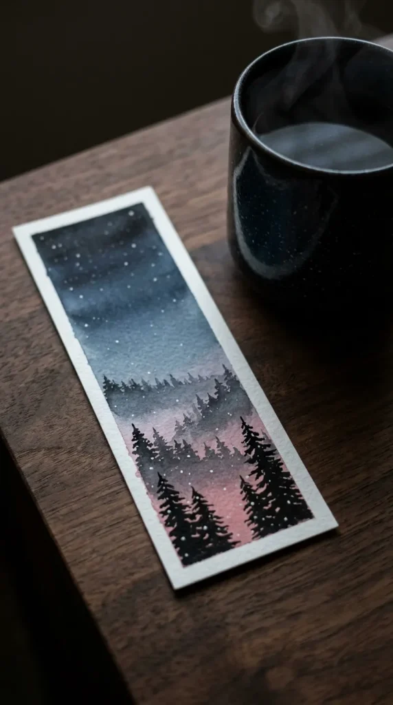
Introduction Deep twilight forests capture the mystery and serenity of mist-covered pines under an evening sky. This modern aesthetic relies on gradients transitioning from twilight blues to velvety blacks.
What This Idea Means Nordic landscape painting evokes quiet reflection and solitude. It uses cool undertones, misty depth, and fine vertical tree silhouettes to create an expansive sense of scale on a tiny strip of heavy cardstock.
How to Make It
- Tape down the borders of your watercolor paper with washi tape to create crisp, clean margins.
- Lay down a smooth wet-on-wet gradient starting with soft dusty rose at the base, blending upward into slate blue, and finishing with deep indigo at the top.
- While the paper is semi-dry, paint faint, misty pine shapes in the background using diluted indigo.
- Once completely dry, mix opaque black gouache or concentrated watercolor.
- Using a size 0 round brush, paint crisp, detailed evergreen trees in the foreground, varying heights and branch densities.
- Finish with tiny splatters of diluted white gouache to simulate distant stars or falling snow.
Tips and Variations
- Keep the foreground tree trunks very thin near the top to maintain realistic proportions.
- Variation: Add a crisp crescent moon using opaque white gouache or a fleck of genuine gold leaf near the upper corner.
3. Modern Terrazzo and Abstract Clay Stone Patterns
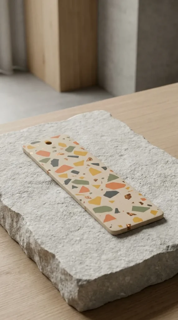
Introduction Terrazzo continues to dominate contemporary interior design, and its playful yet sophisticated aesthetic translates beautifully onto stationery.
What This Idea Means Inspired by Mediterranean composite stone floors, this idea celebrates organic geometric asymmetry. It uses a neutral plaster-like base peppered with hand-painted, irregular chips of earth tones and pastel accents.
How to Make It
- Paint the entire bookmark surface with an off-white, oat, or warm beige matte acrylic paint.
- Mix small pools of acrylic paint in warm terracotta, sage, mustard, dusty rose, and charcoal gray.
- Using a small flat or angled brush, paint small, random geometric shards and specks across the surface.
- Vary the sizes of the stone chips, leaving generous neutral space between clusters.
- Seal with an ultra-matte varnish to replicate the feel of unpolished architectural stone.
Tips and Variations
- Maintain sharp, clean edges on your abstract chips rather than rounded dots.
- Variation: Add occasional flakes of bronze leaf among the painted chips for a luxurious modern touch.
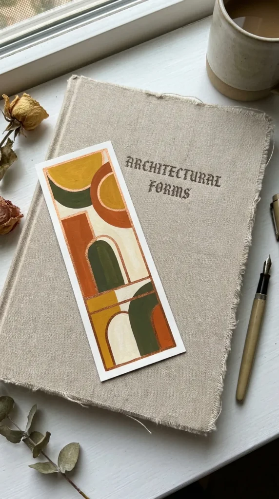
4. Geometric Mid-Century Color Block Abstraction
Introduction Mid-century modern color blocking brings architectural balance, retro charm, and structured vibrancy to your bookshelf.
What This Idea Means This design focuses on clean division of space, utilizing arches, intersecting circles, rectangles, and diagonal slices. It pairs muted vintage tones like mustard yellow, burnt orange, olive, and cream.
How to Make It
- Lightly sketch a composition of overlapping semicircles, thin arches, and vertical rectangles using a hard graphite pencil.
- Use painter’s masking tape to section off clean linear edges.
- Paint each section with rich, flat, matte gouache or acrylic paint to eliminate visible brush strokes.
- Let each section dry fully before taping adjacent shapes to avoid pigment bleeding.
- Add thin, hand-drawn accent lines using a fine gold paint pen running parallel to the curved shapes.
Tips and Variations
- Use opaque gouache rather than translucent watercolor to achieve that signature flat, retro screen-printed feel.
- Variation: Introduce a single raw kraft-paper negative space section to celebrate organic materials.
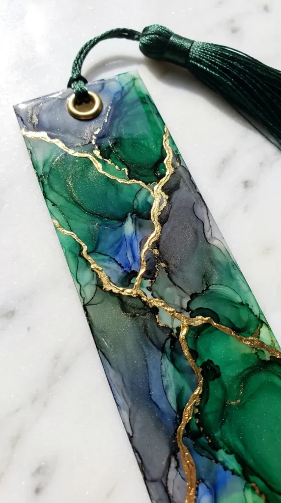
5. Golden Kintsugi and Fluid Alcohol Ink Marble
Introduction Inspired by the traditional Japanese philosophy of repair, this bookmark pairs fluid, organic marbling with intentional metallic fracture lines.
What This Idea Means Kintsugi honors imperfection by mending breaks with lacquer dusted with powdered gold. Translated to bookmark art, it represents beauty within chaos, marrying deep fluid textures with sharp, structured metallic veins.
How to Make It
- Use synthetic, non-porous paper (such as Yupo paper) cut to bookmark size.
- Drop emerald, sapphire, or charcoal alcohol inks onto the surface along with blending solution.
- Use a gentle heat tool or small handheld air puffer to push the inks, creating delicate ripples and translucent layers.
- Once dry, use a fine detail brush and high-density liquid gold leaf paint to draw jagged, organic fracture lines connecting across the fluid cells.
- Punch a top hole and finish with a metallic brass eyelet.
Tips and Variations
- Keep the gold lines intentional and thin; delicate lines feel refined, while heavy lines look clunky.
- Variation: Use soft monochrome gray inks with rose-gold metallic detailing for a softer, bridal aesthetic.
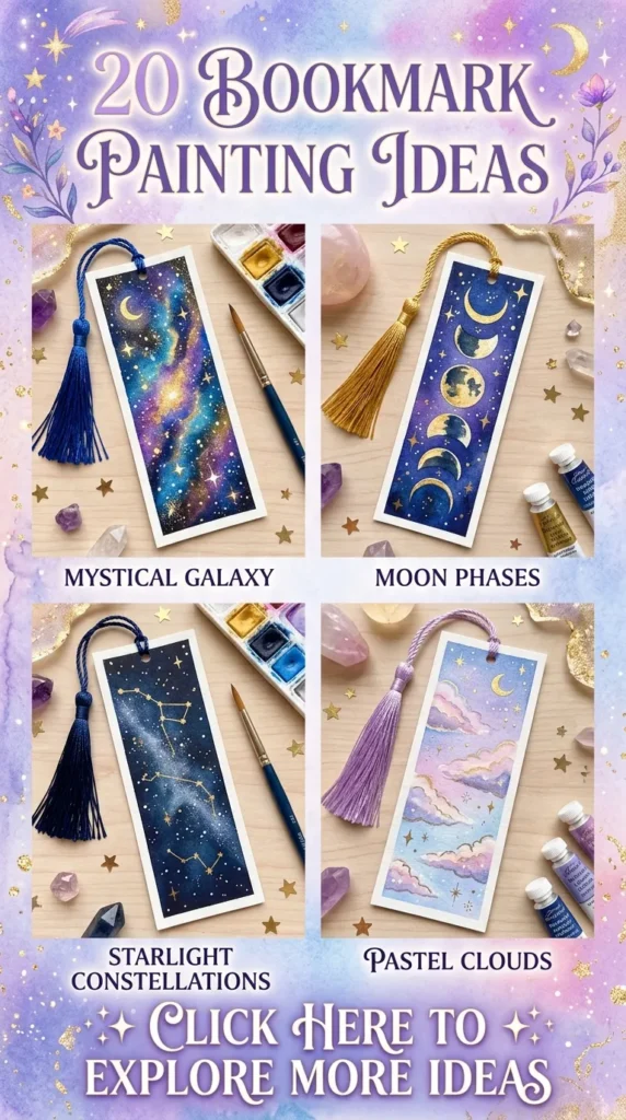
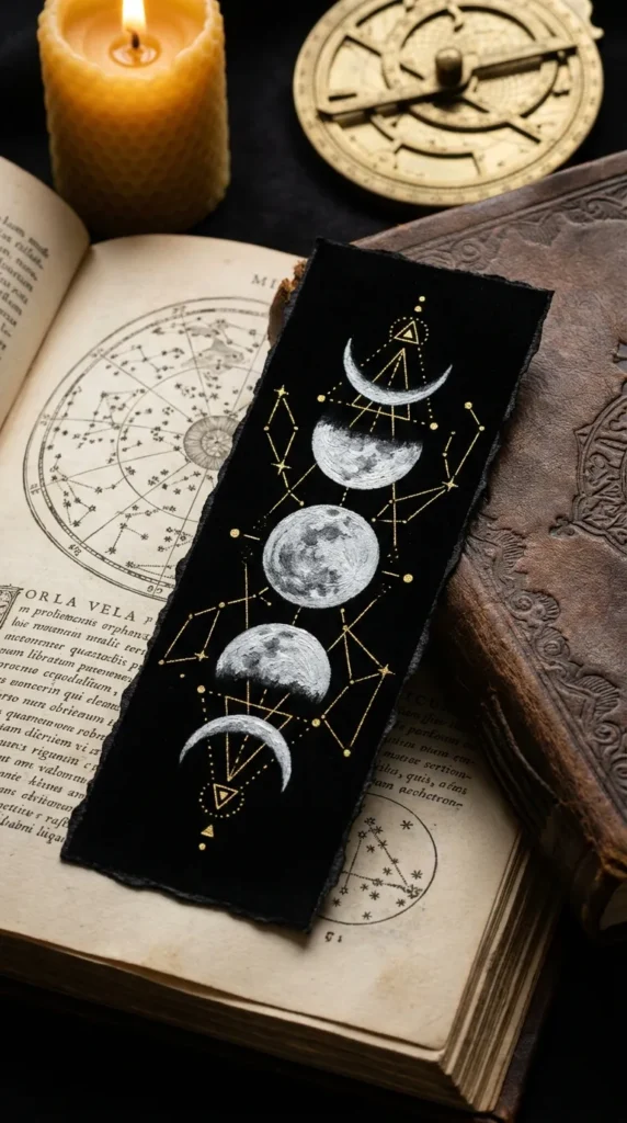
6. Ethereal Celestial Moon Phases and Stardust
Introduction Celestial art brings a sense of wonder and timelessness to reading, making it a natural fit for lovers of fantasy, poetry, and philosophy.
What This Idea Means This concept uses deep, rich black and midnight-blue surfaces to showcase the lunar cycle in precise chronological progression, accented by golden constellations and cosmic dust.
How to Make It
- Paint your base bookmark in pitch-black watercolor paper or deep matte black acrylic.
- Measure and mark five to seven equidistant points along the vertical axis of the bookmark.
- Using white gouache, paint the lunar cycle from top to bottom: waxing crescent, first quarter, full moon, third quarter, and waning crescent.
- Use a dry stippling brush with diluted gray-blue paint to create subtle surface craters and lunar texture on the full moon.
- Paint fine golden lines linking tiny star coordinates around the moons using a 0.05 gold gel pen.
Tips and Variations
- Keep lunar circles geometrically true by using a small stencil or circular coin as a pencil guide.
- Variation: Paint the moon textures in metallic iridescent silver paint that shimmers when catching the light.
7. Pastel Japanese Seigaiha Waves and Modern Water Rhythms
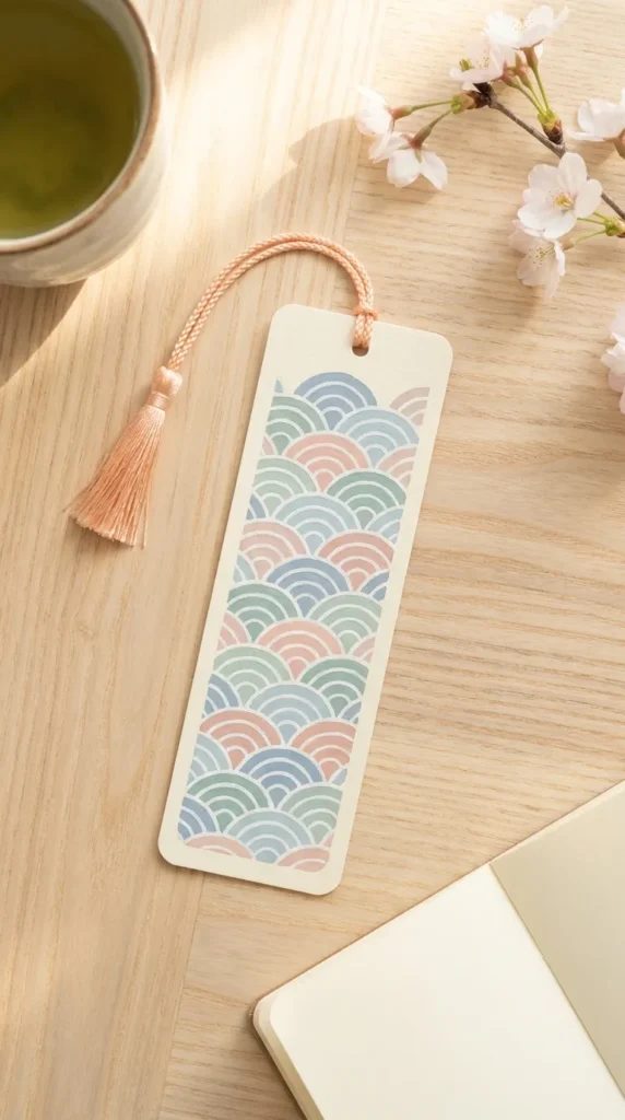
Introduction Traditional Japanese wave patterns reinterpreted through contemporary pastel palettes bring calm, rhythmic balance to a bookmark.
What This Idea Means The Seigaiha pattern represents surges of good luck and resilience. Applying it with a pastel color palette transforms an ancient textile motif into a serene, meditative desktop accessory.
How to Make It
- Apply an even base coat of pastel powder blue, seafoam, or blush acrylic gouache.
- Using a compass or circle template, lightly sketch interlocking concentric semicircles layering downward like scales.
- Paint alternating arches with contrasting pastel hues (cream, soft sage, muted lavender).
- Outline the concentric ridges using an ultra-fine white acrylic marker.
- Seal with a soft satin varnish for durability.
Tips and Variations
- Maintain uniform distance between the concentric arches to preserve the soothing geometric rhythm.
- Variation: Paint only the bottom half with wave patterns, leaving the top half open for a single minimalist hand-lettered word.
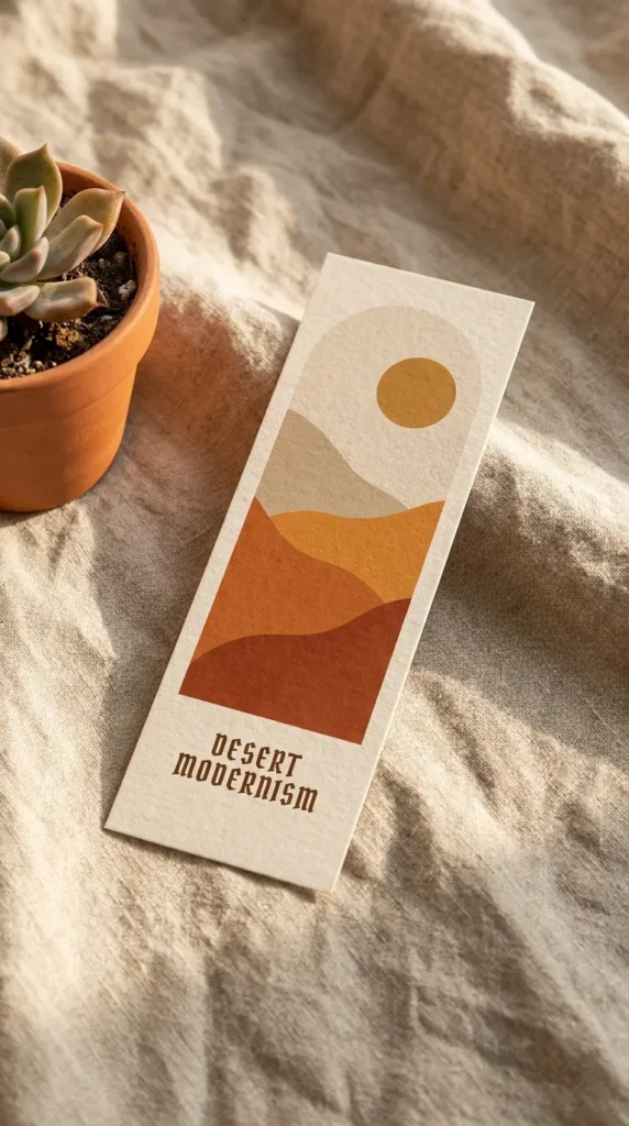
8. Warm Desert Dunes and Abstract Terracotta Horizons
Introduction Desert modernism captures the soothing warmth of sweeping sand dunes, terracotta clays, and sun-baked horizons.
What This Idea Means This aesthetic focuses on warm minimalism, evoking serene desert silence through gentle curved planes, overlapping dunes, and a glowing stylized sun.
How to Make It
- Draw three to four sweeping diagonal curves across the bookmark to establish rolling dune ridges.
- Mix a warm gradient of colors: desert sand, warm beige, terracotta, rust, and burnt sienna.
- Paint each dune layer flatly from top to bottom, progressing from lighter shades in the distance to deeper, richer clays in the foreground.
- Paint a simple, perfect semicircle terracotta or sun-bleached yellow sun resting on the highest ridge.
- Finish the edge of each dune with a crisp, subtle edge line to emphasize shadow and depth.
Tips and Variations
- Use matte acrylic paints mixed with a touch of baking soda or fine sand texture paste for tactile realism.
- Variation: Contrast the warm terracotta dunes with a single deep sage green stylized cactus silhouette.
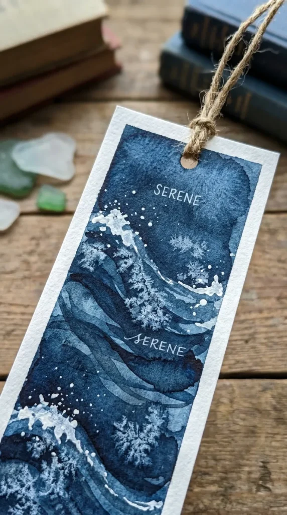
9. Monochromatic Indigo Fluid Ocean Currents
Introduction The power and serenity of deep ocean waters captured through single-pigment indigo washes provide a hypnotic, minimalist look.
What This Idea Means Monochrome painting forces focus onto value, transparency, and water control. This concept celebrates the fluid dynamics of ocean swells, white water foam, and light refraction beneath the surface.
How to Make It
- Work on heavy cold-press paper using professional-grade indigo watercolor pigment.
- Lay down sweeping wet-on-wet layers, letting deep pools of indigo flow into clear water sections.
- Build transparency by layering three to four glaze coats, letting each dry fully to create hard, translucent current lines.
- While the final glaze is damp, use white gouache mixed with a few drops of water on a stiff toothbrush to splatter microscopic sea foam across the darker sections.
- Edge the bookmark borders with a clean, hand-painted white acrylic frame.
Tips and Variations
- Resist using true black; indigo provides much richer depth and organic coolness.
- Variation: Use sea salt crystals dropped onto the wet indigo paint to create crystalline, sea-spray textural blooms.
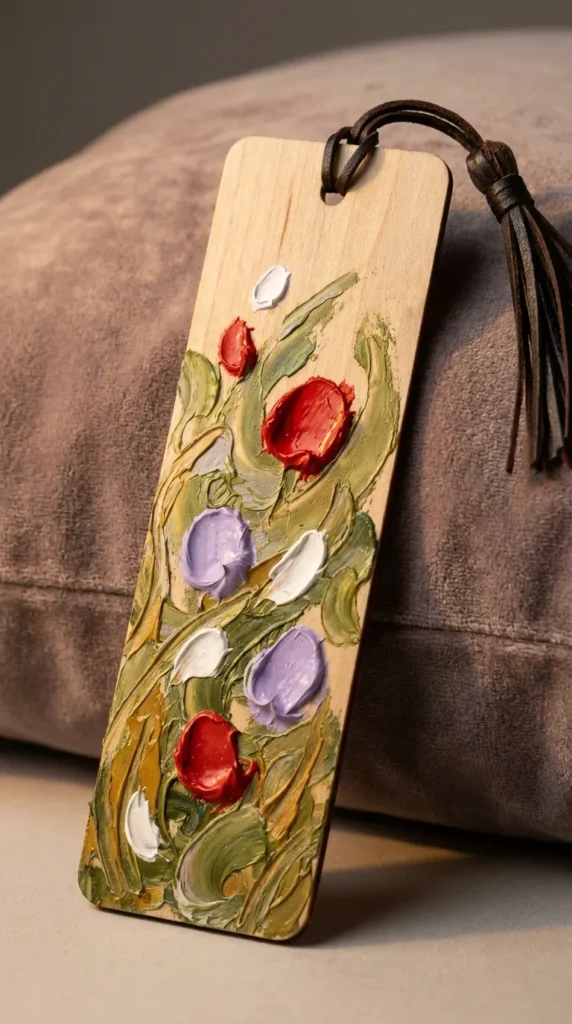
10. Textured Impressionist Wildflower Meadows
Introduction Richly textured floral bookmarks bring the tactile joy of oil paintings and blooming spring hillsides straight to your reading nook.
What This Idea Means Using heavy-body acrylics or oil pastels, this idea leans into the Impressionist philosophy of capturing light and movement through distinct, thick brushstrokes rather than tight botanical accuracy.
How to Make It
- Paint a soft, hazy background representing sky and distant greenery using smooth acrylic blends.
- Switch to heavy-body acrylic paint or dimensional modeling paste mixed with color.
- Using a miniature palette knife, apply thick dabs and sweeps of paint to form foreground wild grasses.
- Dot pure cadmium red, lavender, yellow ochre, and titanium white using the tip of the knife to form blooming floral heads.
- Let the dimensional paint cure for 48 hours before applying a protective gloss spray.
Tips and Variations
- Do not over-blend the floral dots on the surface; maintain thick peaks that catch light.
- Variation: Paint on a genuine thin birch wood bookmark blank to complement the organic, rustic wildflower theme.
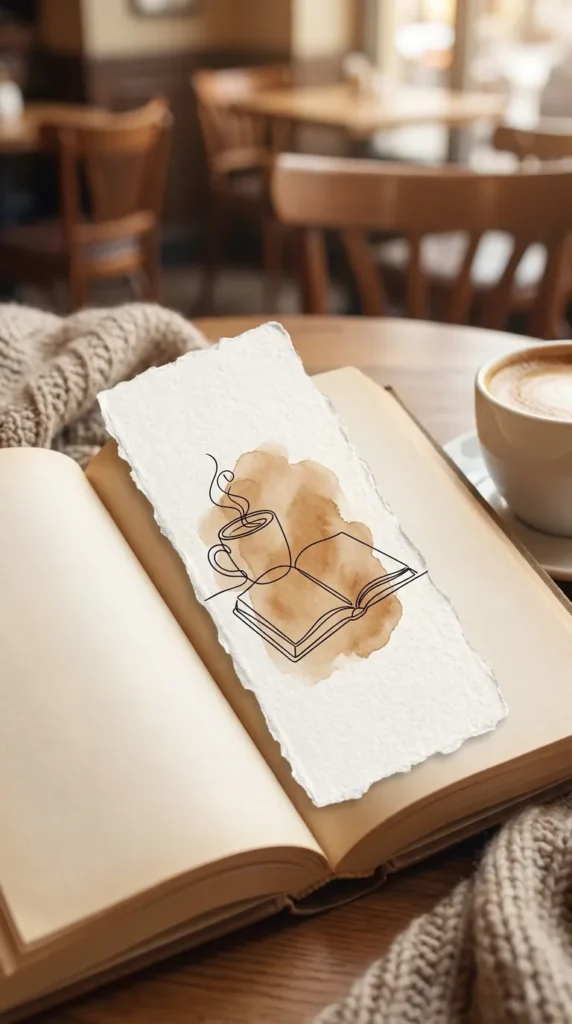
11. Minimalist Line Art Coffee and Bookish Still Life
Introduction A celebration of slow mornings, steam rising from ceramic mugs, and open pages, this concept speaks directly to passionate readers.
What This Idea Means Continuous line art strips away unnecessary distraction, capturing the comforting essence of a reading corner with a single, deliberate ink stroke.
How to Make It
- Paint a subtle, off-center organic watercolor blob in warm chai, coffee-stain brown, or biscuit beige.
- Using a 0.2mm waterproof black fineliner, draw a continuous, unbroken line that forms an open book resting beside a steaming ceramic mug.
- Avoid lifting the pen entirely if possible; loop back over lines to build organic structure.
- Add tiny, stylized floating sparkles or stars around the steam to evoke cozy warmth.
- Finish with an unbleached raw twine tassel tied through the top hole.
Tips and Variations
- Practice the continuous line drawing on scrap paper several times before committing to the final bookmark.
- Variation: Paint the background shape using actual brewed espresso for an authentic sepia tint and subtle aroma.
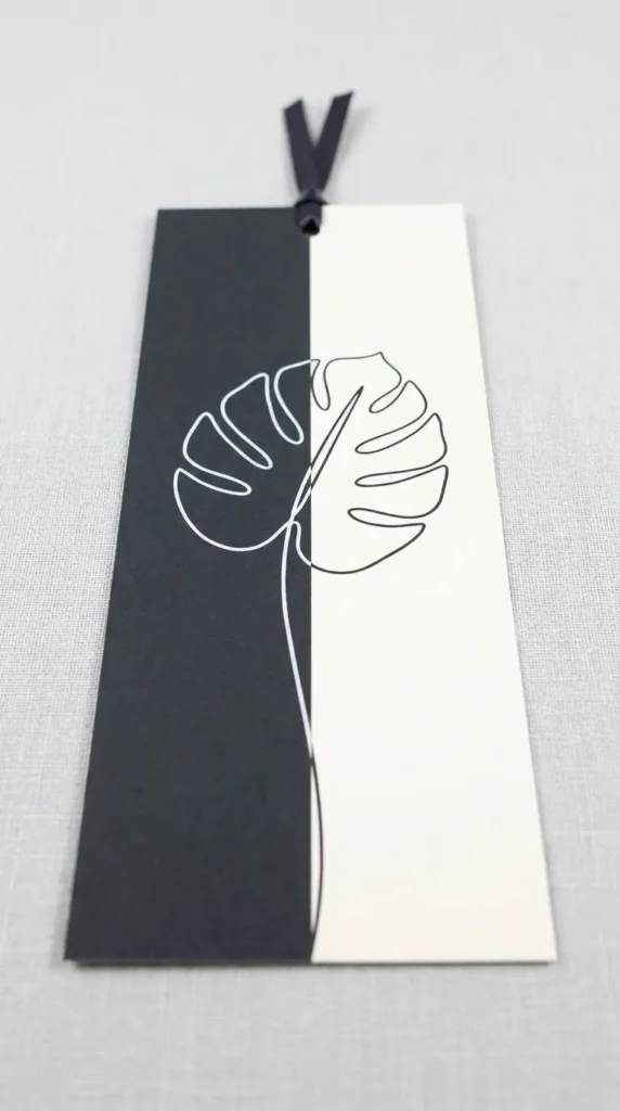
12. Modern Split Two-Tone Botanical Monoline
Introduction A bold, graphic style that splits the bookmark vertically down the center, creating a striking high-contrast study in positive and negative space.
What This Idea Means This design explores visual duality: light against dark, simplicity against complexity. It creates a sleek, gallery-worthy bookmark suitable for architectural and design enthusiasts.
How to Make It
- Divide your bookmark exactly in half vertically using low-tack masking tape.
- Paint the left side in solid, deep jet-black or midnight navy, leaving the right side crisp white.
- Remove the tape once completely dry.
- Draw a single continuous monstera leaf or fern stem running straight up the center dividing line.
- On the white side, draw the plant elements using a black archival pen; on the dark side, draw the corresponding halves using an opaque white gel pen.
Tips and Variations
- Ensure your central line is ruler-straight to maximize the high-contrast graphic effect.
- Variation: Replace the black side with deep emerald green and use metallic gold ink for the leaf detailing.
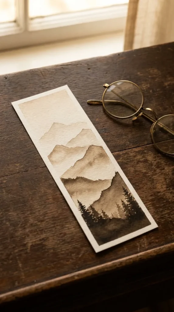
13. Atmospheric Foggy Mountain Ridges in Sepia
Introduction Layered mountain silhouettes disappearing into misty mountain air bring a sense of scale, stillness, and quiet adventure to books.
What This Idea Means This landscape approach uses atmospheric perspective, where objects further away appear lighter, softer, and less detailed, while foreground ridges are sharp and rich in tone.
How to Make It
- Mix five distinct values of sepia or charcoal gray watercolor, ranging from 10% opacity to 90% opacity.
- Paint the furthest, top mountain ridge with the lightest wash and soften the lower edge with a wet brush.
- Once dry, paint the next ridge lower down with the second lightest value, again feathering the base.
- Repeat this process moving down the bookmark, increasing pigment saturation with each layer.
- Paint the final foreground ridge in rich, concentrated dark sepia with sharp crags and miniature pine tree peaks.
Tips and Variations
- Always wait for the previous ridge to dry completely to prevent mountain peaks from bleeding together.
- Variation: Paint a tiny glowing full moon rising just behind the second furthest mountain layer.
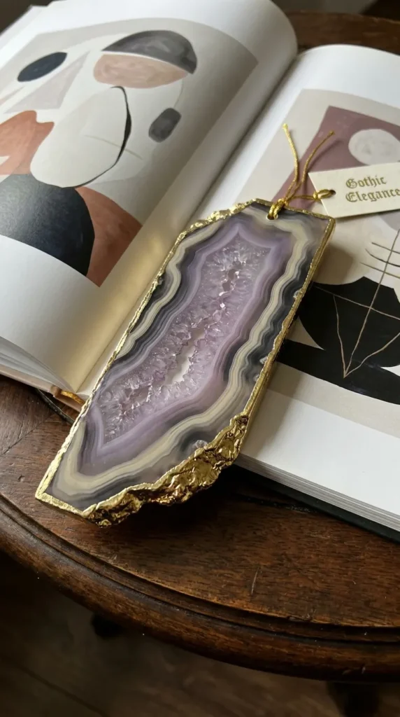
14. Polished Agate Slice Geode with Metallic Gilded Edges
Introduction Simulating the cross-section of a natural crystal geode turns paper into an imitation of polished stone.
What This Idea Means Geode art captures the rhythmic banding of minerals forming over millions of years. Concentric crystalline bands, translucent watercolor glazes, and shimmering metallic mineral veins create rich tactile luxury.
How to Make It
- Start from the center of the bookmark and paint a pale, crystalline core using soft lavender or raw quartz tones.
- Paint concentric, organic, undulating rings moving outward, alternating between amethyst purple, slate gray, and white gouache.
- Drop fine table salt onto the wet purple sections to mimic crystalline mineral spotting.
- Once dry, paint fine, jagged veins connecting the bands using bright liquid gold leaf.
- Paint the entire outer raw edge of the bookmark with heavy gold paint to simulate a gilded rock edge.
Tips and Variations
- Keep the organic rings wavy and slightly irregular rather than uniform concentric ovals.
- Variation: Create a green malachite or teal turquoise geode version using rich emeralds and copper leafing.

15. Pop-Art Modern Abstract Memphis Geometry
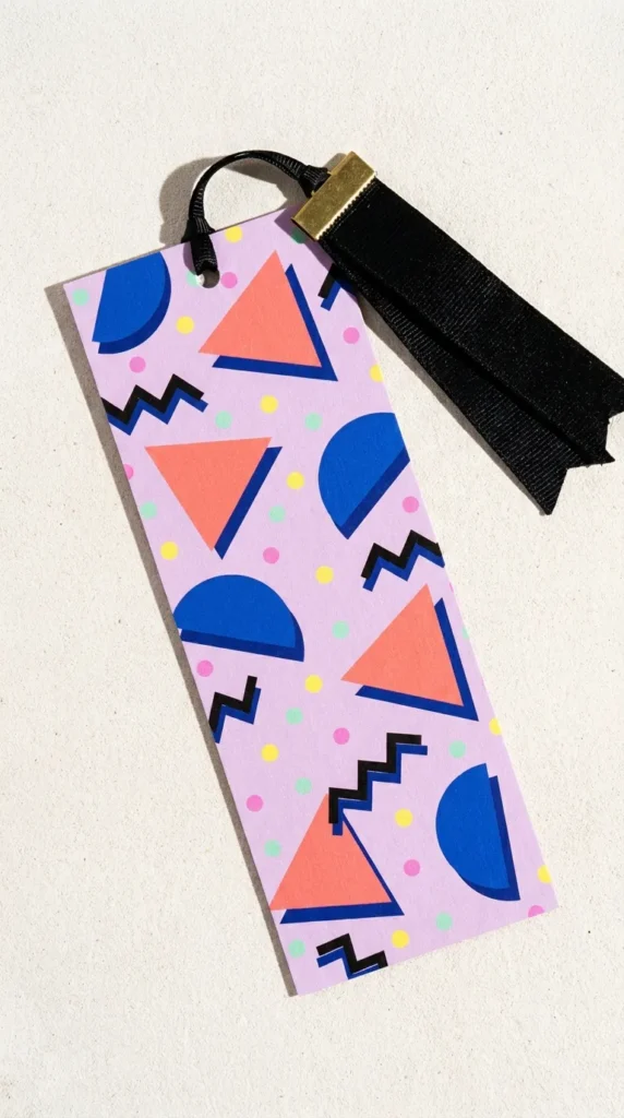
Introduction Energetic, vibrant, and unabashedly playful, Memphis-inspired pop geometry brings bold 1980s retro energy into contemporary desk spaces.
What This Idea Means The Memphis design movement combines bold contrasting colors, graphic squiggles, polka dots, floating grids, and flat geometric shapes to create dynamic, joyful compositions.
How to Make It
- Apply a vibrant pastel background like buttercup yellow, pale lilac, or mint green.
- Paint bold, contrasting shapes: a coral pink triangle, a royal blue circle, and a mint green rectangle scattered across the canvas.
- Using a medium-point black acrylic marker, add classic Memphis pattern accents: floating black squiggles, checkerboard grids, and clusters of tiny black confetti dots.
- Outline one or two of the primary shapes with a thick, graphic black offset shadow.
- Punch a hole and finish with a neon pink or electric blue woven cord.
Tips and Variations
- Avoid overfilling; leave enough pastel background visible so each graphic element pops clearly.
- Variation: Use a matte black base with neon pastel floating shapes for an electric 90s-inspired look.
16. Vintage Cottagecore Pressed Ferns and Wild Herbarium
Introduction Channeling the beauty of antique natural history collections, this style captures botanical specimens as if preserved inside vintage library archives.
What This Idea Means The herbarium aesthetic celebrates botanical documentation. It pairs realistic botanical gouache paintings with aged paper washes and delicate calligraphy labels.
How to Make It
- Stain your watercolor paper with brewed black tea or a wash of raw umber to create an antique, aged parchment patina.
- Lightly sketch a specimen stem, such as a delicate maidenhair fern or wild chamomile plant.
- Paint the botanical illustration with opaque gouache, paying attention to leaf ribs, stem junctions, and subtle variations in green.
- Add tiny faux specimen tape marks at the stem ends using cream paint with translucent brown shading.
- Write a delicate faux botanical classification (e.g., Adiantum capillus-veneris) in fine script near the bottom in sepia ink.
Tips and Variations
- Lightly distress the outer paper edges with a sanding block or dry brown ink pad for authentic vintage character.
- Variation: Seal a real dried, pressed four-leaf clover or baby fern onto the paper using matte decoupage medium before framing with paint.
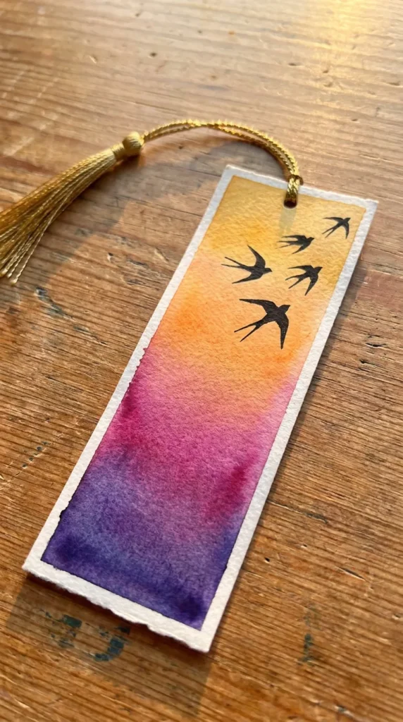
17. Vibrant Sunset Gradient with Minimalist Flying Swallows
Introduction The silhouette of migrating swallows against a sunset sky represents freedom, poetry, and peaceful transitions.
What This Idea Means This idea utilizes the dramatic warmth of twilight skies. The visual contrast between a glowing ombre background and sharp, aerodynamic bird silhouettes produces immediate emotional resonance.
How to Make It
- Tape down your watercolor paper for crisp borders.
- Lay down a rich wet-on-wet gradient starting from lemon yellow at the base, blending into warm apricot, magenta, and rich violet at the very top.
- Ensure your transitions are smooth by brushing horizontally with a soft, wide blending brush.
- Once bone dry, use a 0.1mm black archival fineliner to draw three to five swallow silhouettes swooping upwards.
- Draw the swallows in varying sizes to create natural perspective, with the largest near the top and tiny silhouettes trailing below.
Tips and Variations
- Work quickly when blending the watercolor gradient to avoid dried watermarks across the sky.
- Variation: Add fine gold ink details along the leading edge of the swallows’ wings for subtle luxury.
18. Modern Gouache Matte Fruit Studies (Citrus and Pomegranate)
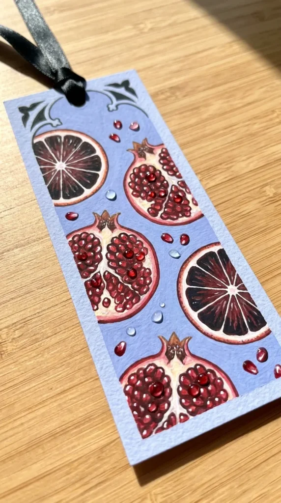
Introduction Fruit studies in modern still life celebrate plump forms, juicy hues, and graphic kitchen warmth, making reading sessions feel sunny and inviting.
What This Idea Means Moving away from classic dark oil paintings, modern fruit studies feature bright, flat backgrounds, sliced geometric citrus or opened pomegranates, and bold, contemporary color pairing.
How to Make It
- Paint a solid, vibrant background in pastel periwinkle blue or deep sage green.
- Sketch sliced blood oranges or open pomegranates showing glistening seeds.
- Fill in the citrus rinds and pulps with vibrant shades of coral, cadmium orange, and deep ruby gouache.
- Paint crisp white pith dividing lines with an opaque white liner.
- Add tiny dots of glossy dimensional varnish exclusively over the pomegranate seeds or citrus pulp to create juicy, tactile contrast against the matte background.
Tips and Variations
- Keep the gouache paint consistency like heavy cream to ensure flat, non-streaky coverage.
- Variation: Paint Mediterranean lemons paired with deep cobalt blue Mediterranean tile patterns beneath.
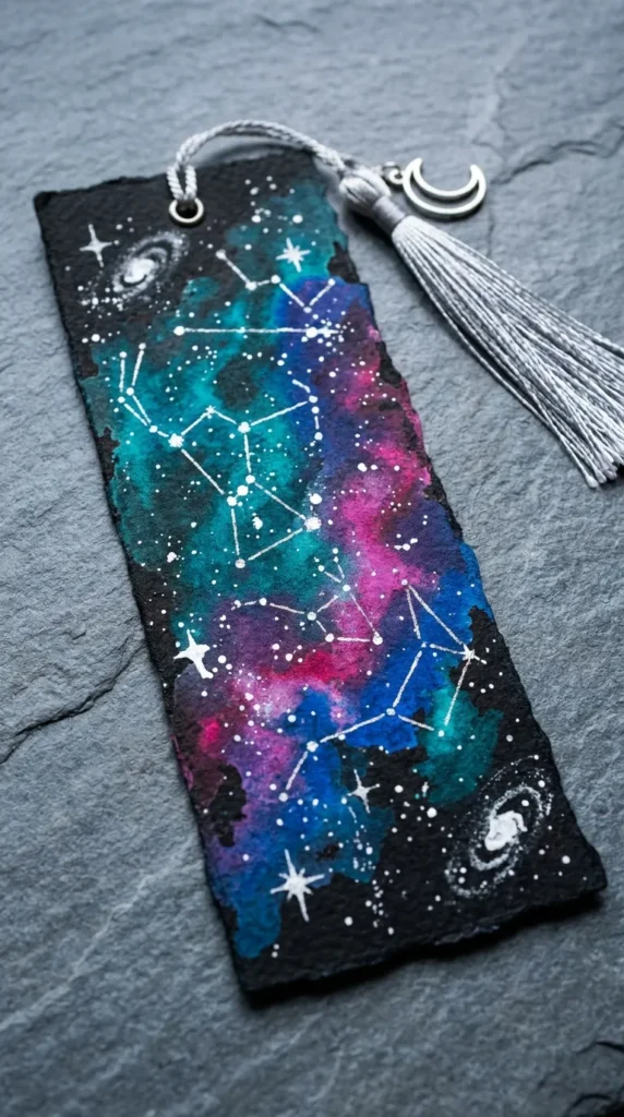
19. Cosmic Nebulae Galaxy with Shimmering constellations
Introduction A deep cosmic bookmark pulls readers straight into the stars, offering an expansive universe on a slender strip of paper.
What This Idea Means Galaxy painting celebrates deep-space photography, rich pigment layering, and cosmic luminosity. It uses layered clouds of magenta, cyan, and deep space black highlighted by metallic stellar coordinates.
How to Make It
- Wet the entire bookmark and drop concentrated pigments of turquoise, magenta, and royal blue in diagonal, swirling clouds.
- Paint deep ivory black around the outer borders, bleeding inward toward the bright nebula cloud core.
- Once completely dry, use a stiff brush to flick fine droplets of white gouache across the paper for distant star clusters.
- Use a ruler and metallic silver or gold pen to link specific major star groups into recognized constellations (such as Ursa Major, Orion, or Cassiopeia).
- Add a single shimmering jewel-like crystal dot at major stellar intersections using dimensional glue.
Tips and Variations
- Leave small pockets of pure white paper untouched initially to make the core of the nebula appear intensely bright.
- Variation: Personalize the bookmark by painting the user’s specific zodiac constellation across the cosmic core.
20. Modern Neutral Plaster and Architectural Archways
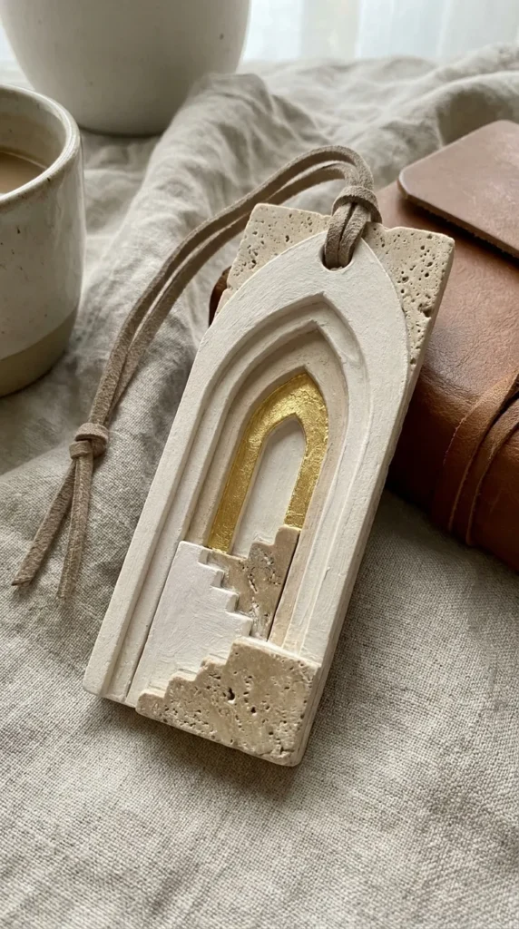
Introduction Inspired by modern Mediterranean architecture, sculptural plaster art, and warm minimalism, this bookmark functions as a tiny architectural canvas.
What This Idea Means This idea focuses on form, shadow, and tactile depth. It uses soothing monochrome neutrals (chalk white, travertine beige, warm linen) and structural geometric archways to evoke serene sanctuary spaces.
How to Make It
- Mix modeling paste or heavy acrylic gesso with warm stone-gray acrylic paint.
- Apply the paste to a thick board or bookmark blank using a palette knife, creating smooth, sculpted dimensional arches and stair steps.
- Allow the plaster paste to cure fully until rigid and stone-like.
- Paint subtle cast shadows along the interior curves of the archways using diluted warm umber to enhance depth.
- Accent the base of the lowest arch with a single minimalist line drawing of a terracotta vase or olive sprig.
- Thread a thick, unspun raw wool or neutral suede cord through the top.
Tips and Variations
- Keep the palette strictly neutral to emphasize sculptural shadows and architectural texture.
- Variation: Paint the interior of the archway with genuine gold leafing to create the illusion of a sunlit doorway.
Essential Materials and Finishing Guide for Painted Bookmarks
To ensure your painted bookmarks last for years without curling, fraying, or bleeding onto delicate book pages, use proper materials and finishing techniques:
- Paper Weight: Always use a minimum of 300 GSM (140 lb) cold-press or hot-press watercolor paper, heavy Bristol board, or 1.5mm birch wood blanks.
- Sealing: Seal all watercolor and gouache work with a non-yellowing, archival matte or satin UV protective spray. For acrylics, use a brush-on polymer varnish.
- Tassels and Ribbons: Choose high-quality materials such as raw silk ribbons, unbleached cotton twill, genuine suede cords, or hand-spun linen yarn.
- Eyelets: Protect the top punch hole from tearing by pressing in a 4mm metallic eyelet (brass, copper, or matte black) using a dedicated eyelet punch.